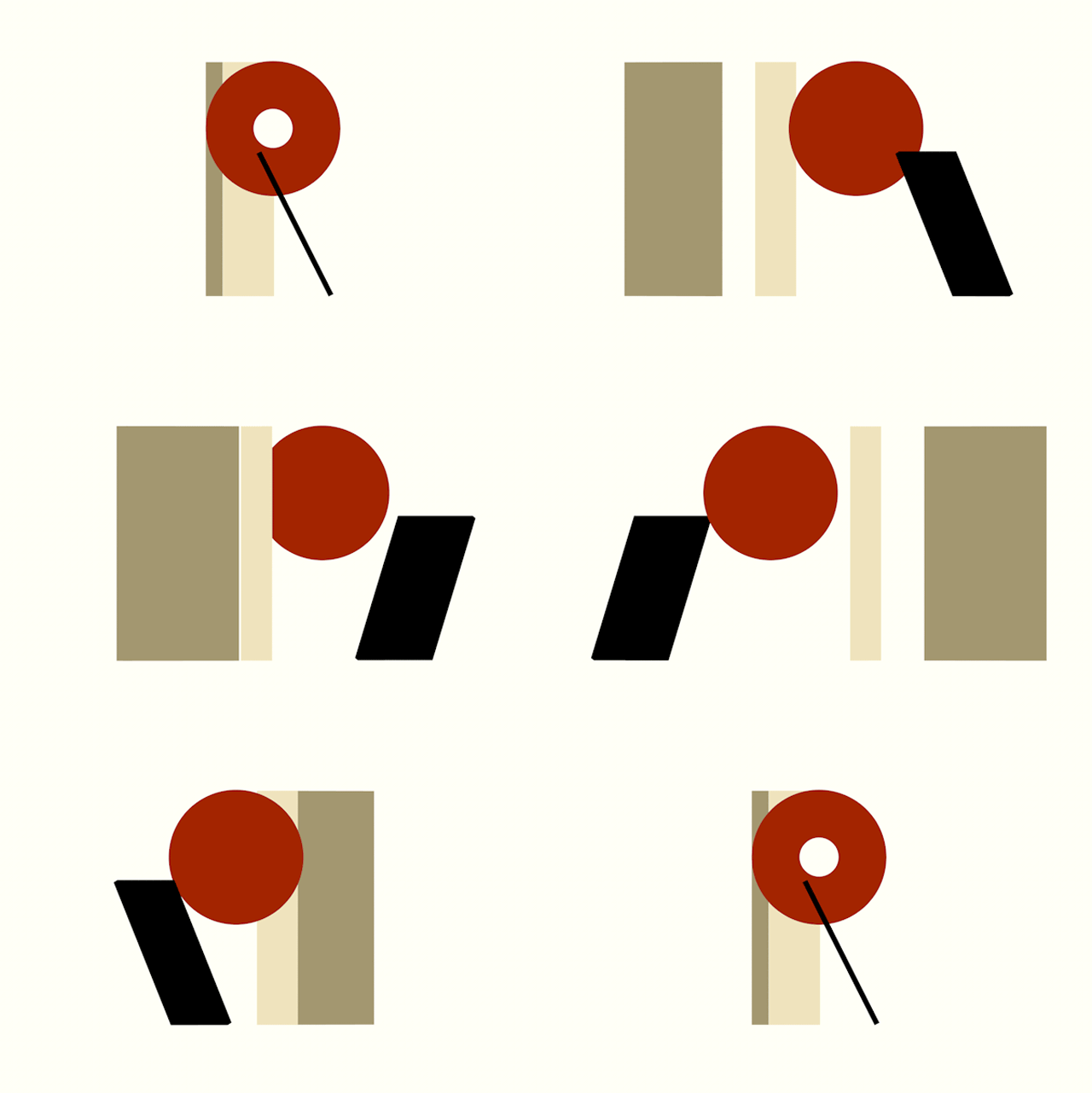
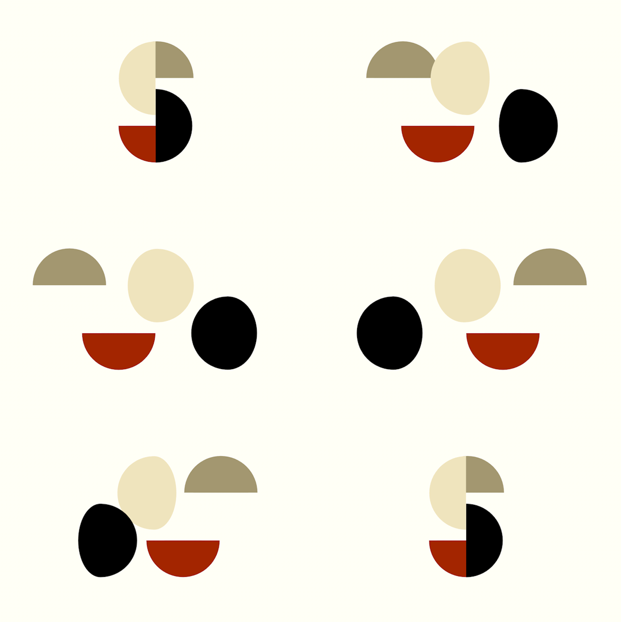
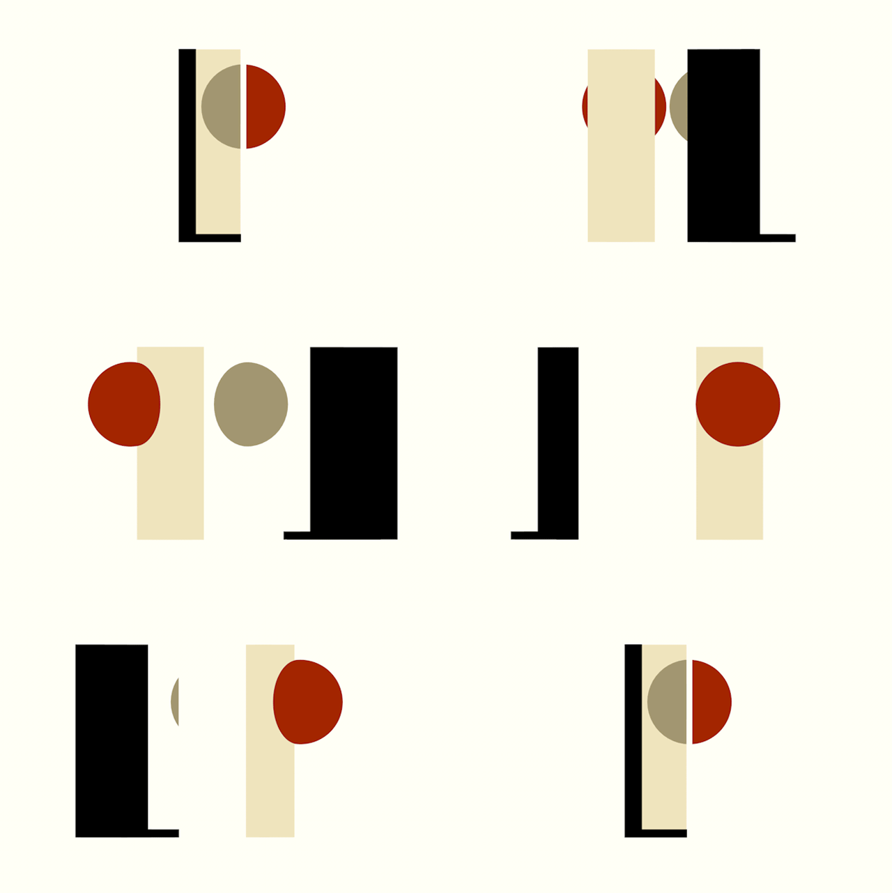
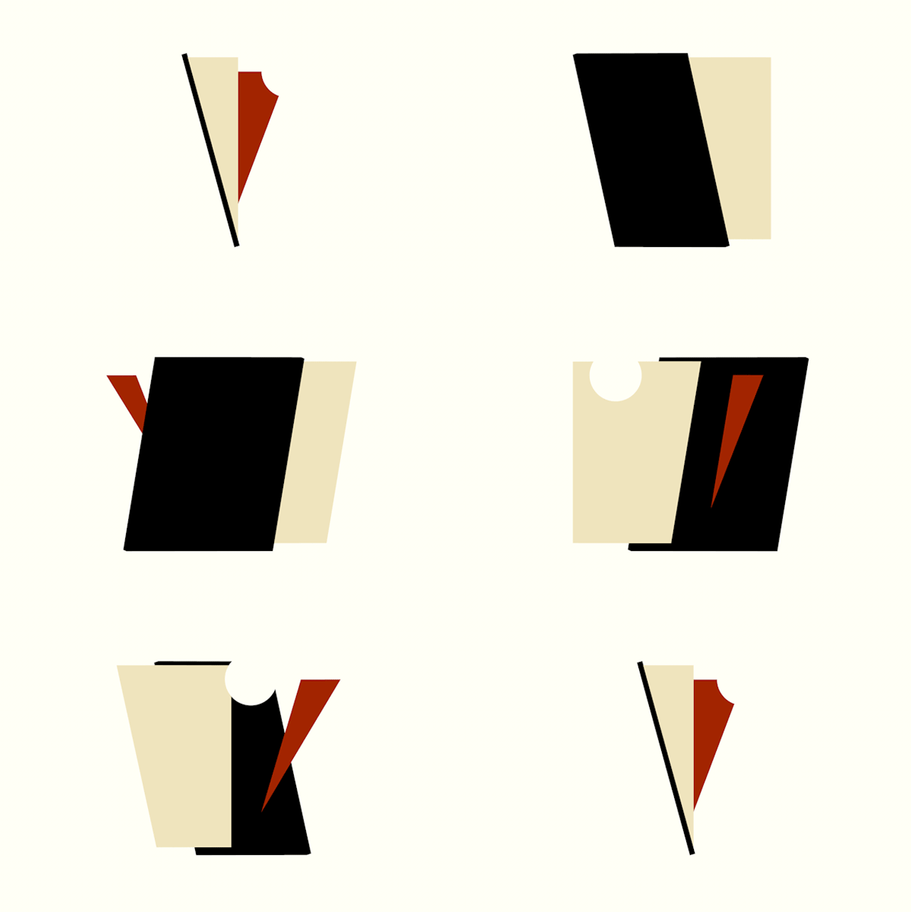
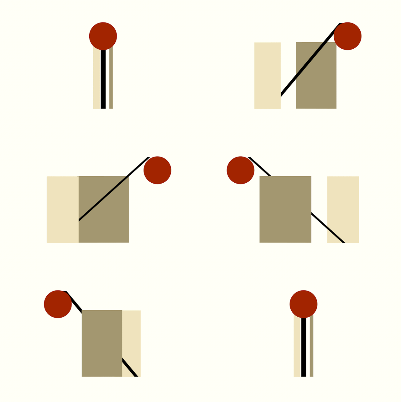
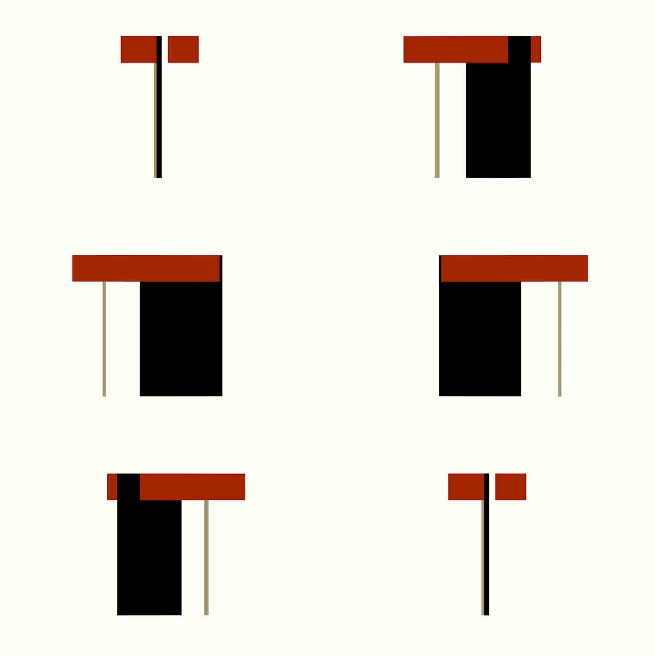
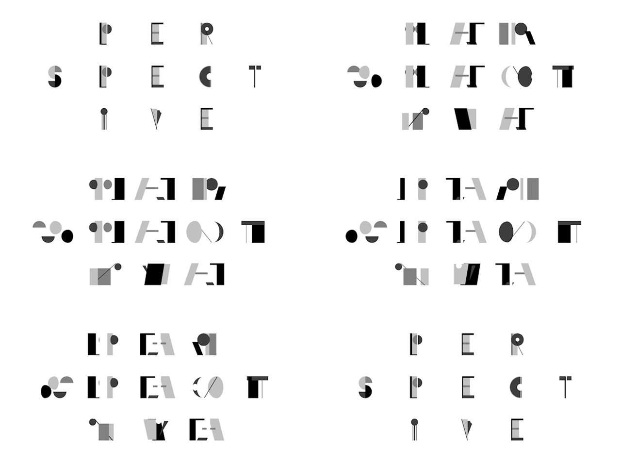
Romanian designer and illustrator Valeriu Nechita has us dizzy with delight over his spinning typography! Based in the Netherlands, this artist uses the same colour for each character. He's taken an angular approach while still bringing the viewer fluidity and movement with the help of the GIF.
While it might be a bit difficult to read a sentence with this typography, we reckon reading isn't really necessary with this perspective. We had fun just trying to read one word. Valeriu's characters have us running round and round, enticing a hypnotic calm to our emotions.
If you visit his website, Hora Studio, you can see he's got a strong sense of style that uses positive and negative space and also movement. We love all his work, but in our opinion, Perspective typography really just comes full circle.

