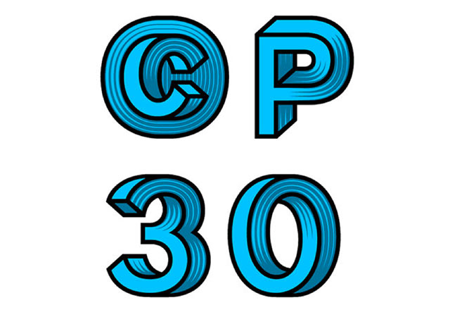
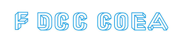
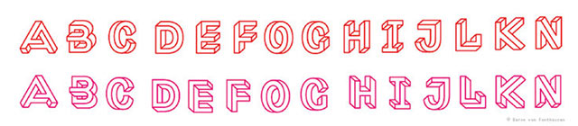
Our first Typo Tuesday for the year, and today we are very excited to show you an awesome optical illusion font by Dutch Font Designer Jacques Le Bailly (aka Baron Von Fonthausen).
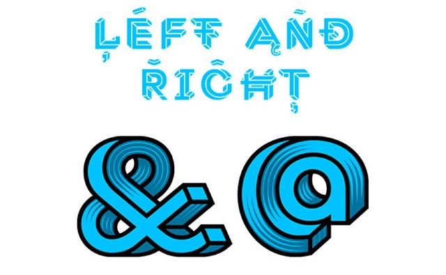
Inspired by M.C Escher and Oscar Reutersvärd, Le Bailly set about creating a typeface in which every letter was in itself an optical illusion; in the vein of the "impossible triangle".
Despite the complexity involved in creating such a typeface, Le Bailly continued to push himself and produced variants of the font, including a shaded version, loosely based on 19th-century wood engravings, just for good measure.
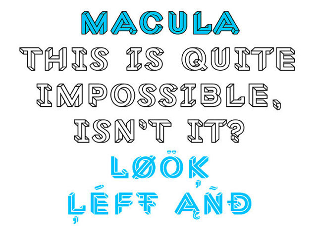
The final product 'Macula' is an amazingly intricate and beautiful typeface. More information about Le Bailly can be found on his website.
"Some letters were easy to construct, others were far more complex. Often the simple letters were the most difficult, because they offered very few possibilities or starting points. I wanted to avoid designing artificial shapes as much as possible. To keep the typeface lively every single character, down to the punctuation and floating accents, needed to have two versions, as if looked at from two different viewpoints. Sometimes the first version came together very quickly, and then it took an eternity to find a good second one."
~Jacques Le Bailly
.png?width=1360&height=900&upsize=true&upscale=true&name=6%20(1).png)