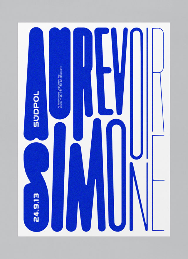
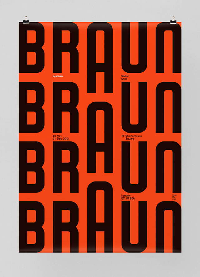
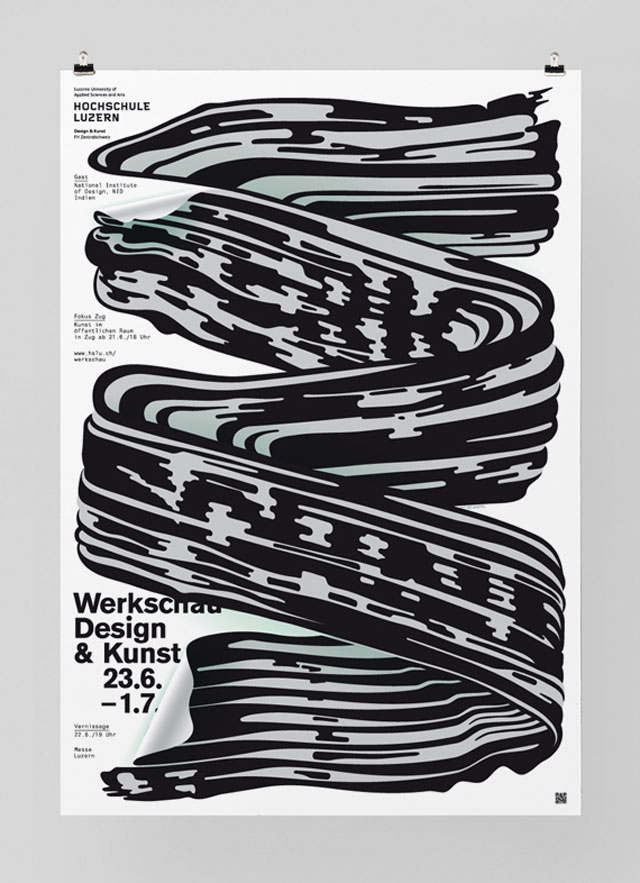
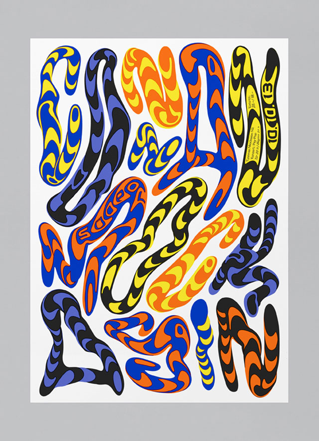
If you're looking for something funky, foxy and fonty, look no further than Felix Pfäffli from Switzerland! The graphic designer goes by Feixen, and he teaches typography and various styles of design at the Lucerne School of Graphic Design. He also owns his own studio, and his work has appeared all over the place in the form of magazines, posters, exhibitions and more.
We stumbled on his work via one of our favourite blogs, But Does It Float. We like how he has many contrasts, thick to thin typography, structured to chaotic forms along with several varieties of colour disparity. In an interview with Design Boom, he describes his style: "Reductive and illustrative. I try to create images that are simple, loud and concise. I hate to repeat myself. Perhaps you could describe it as a straightforward pop with a touch of Swiss tradition."
Follow him on Twitter or pin him down on Pinterest to see what he'll do next!


