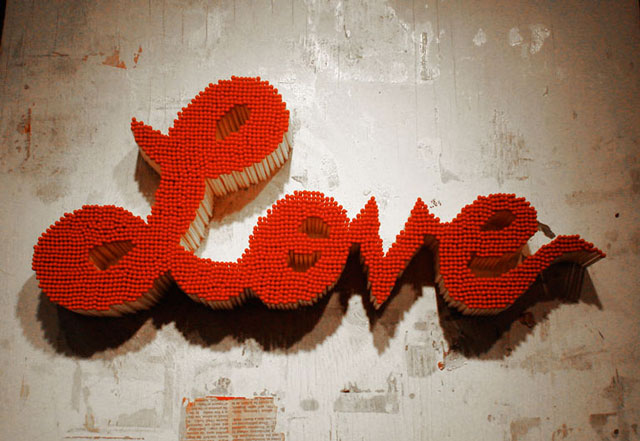
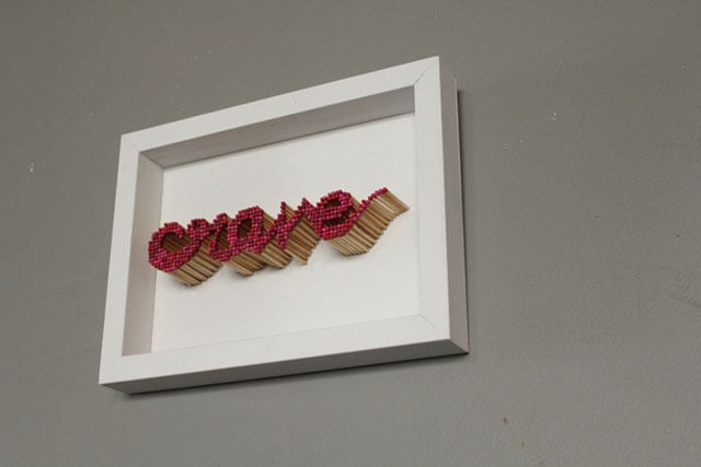
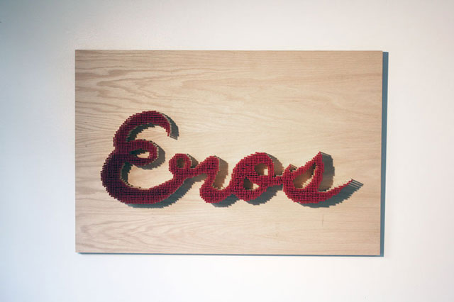
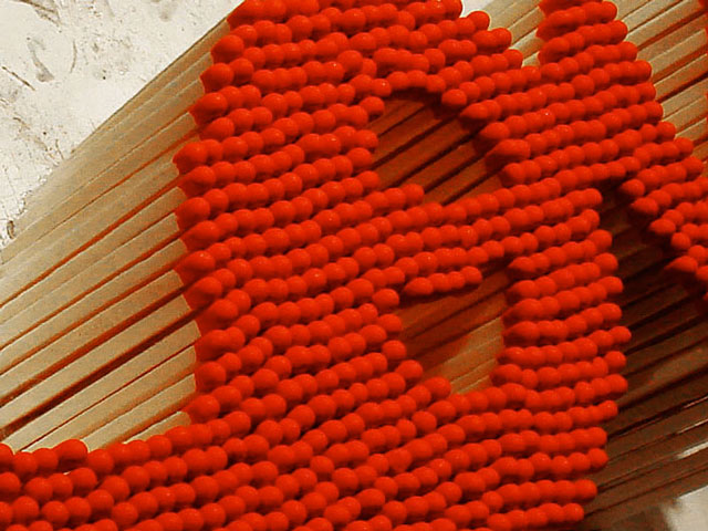
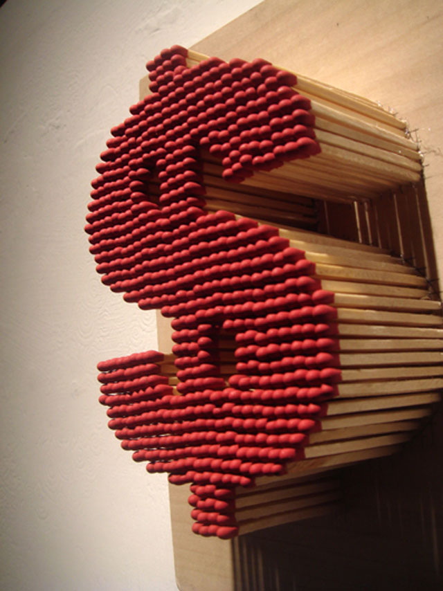
Pei-San NG is a Chicago based typographer, and she has a background in science, architecture and design. Her portfolio has a few pieces that really turn the heat up.
Pei's matchstick typography has received international attention, and her website explains her rationale behind the concept.
“In Chinese culture red is a very lucky color, matches evoke danger. I think that by mixing those two messages the audience is forced to take a second or third look. I want to tempt the viewer to destroy my artwork.”
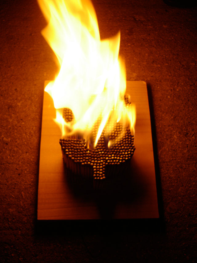
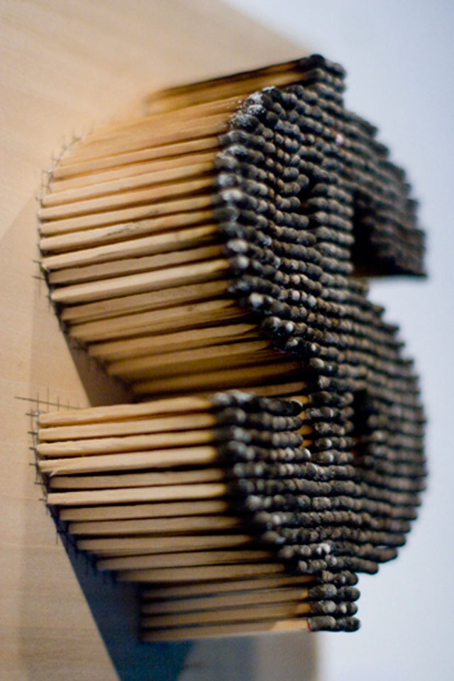
We definitely don't want to destroy it, but our studio really lit up when we saw the examples she actually set on fire. It's a really striking difference. Some designers at Headjam like the post-flame typography best. What's your favourite?
