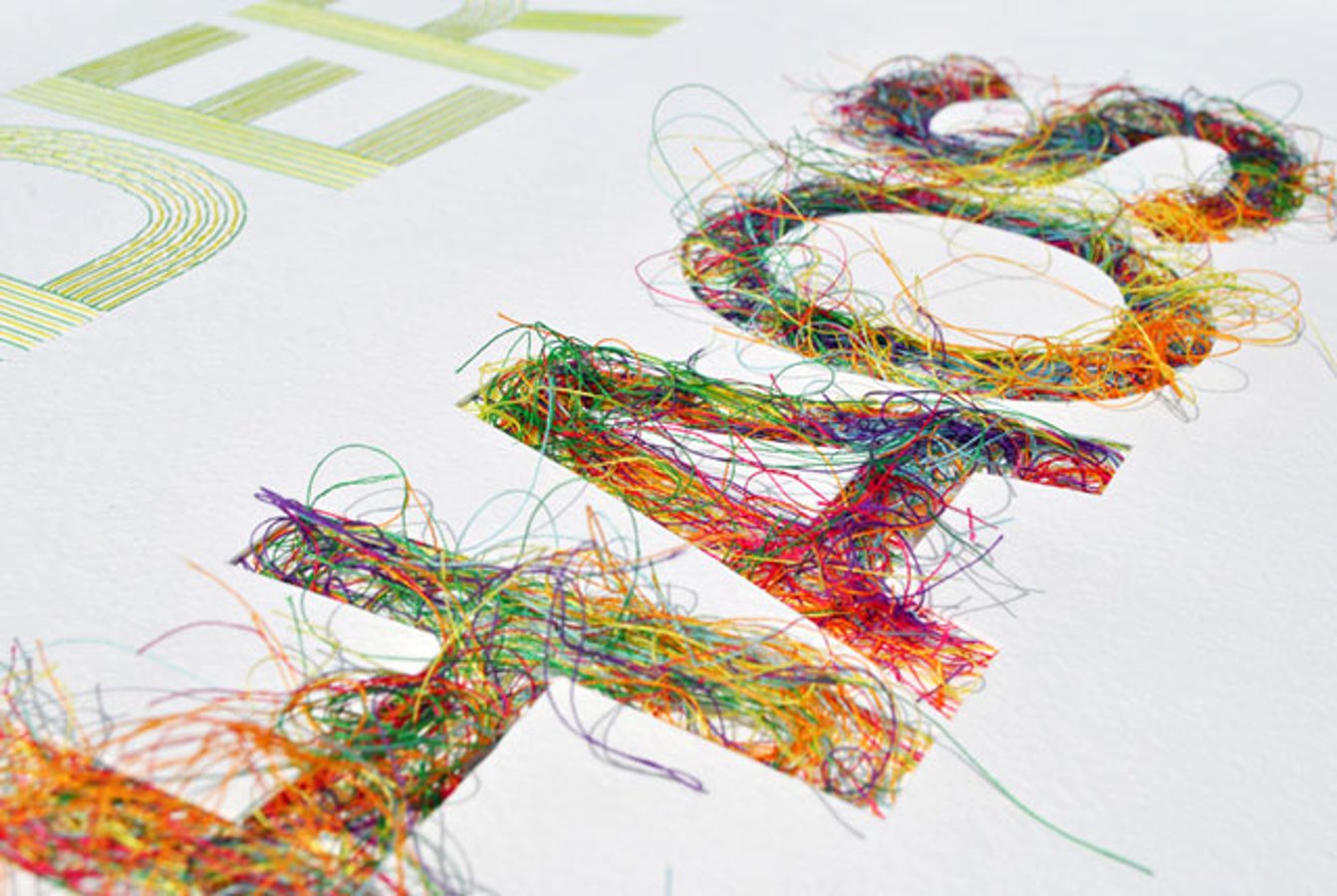
Typo Tuesday: Less Is More
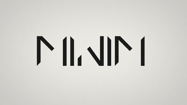
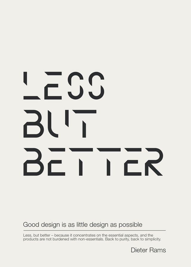
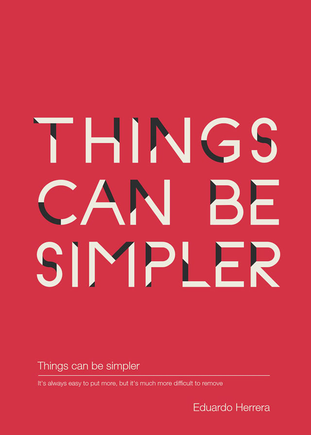
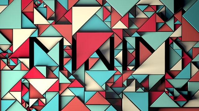
This week on Typo Tuesday Headjam features Minim, a hip new project from Spanish designer Ion Lucin that displays his diverse skillset and sophisticated philosophy: "simple yet complicated, less but better".
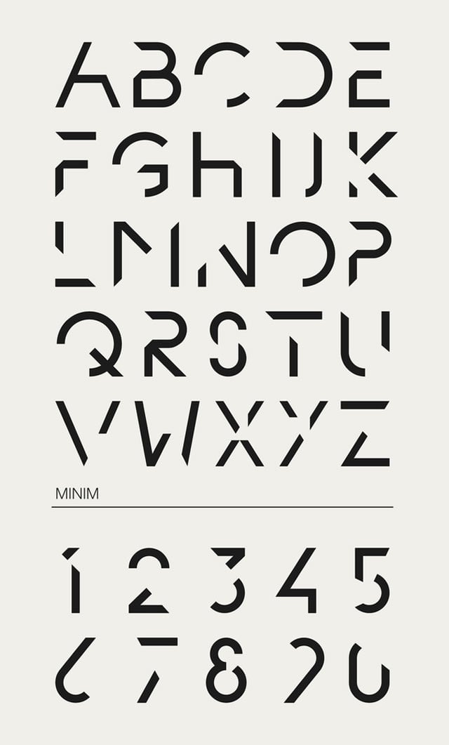
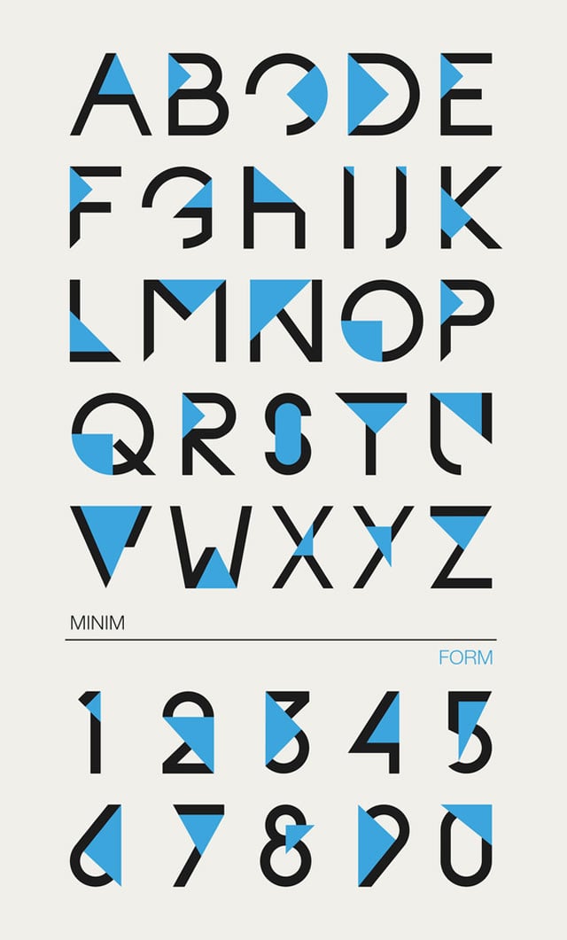
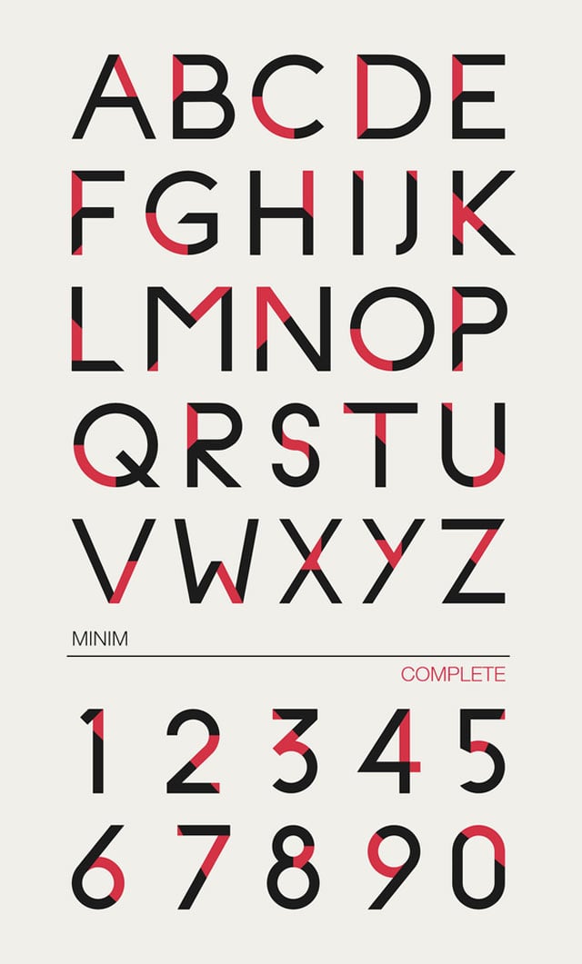
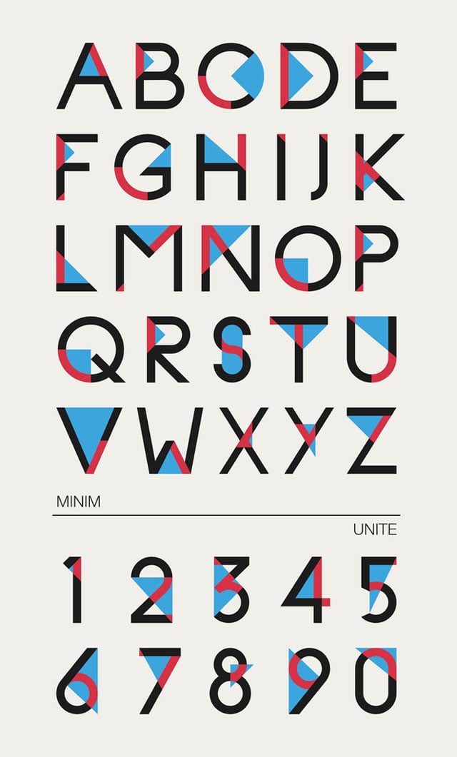
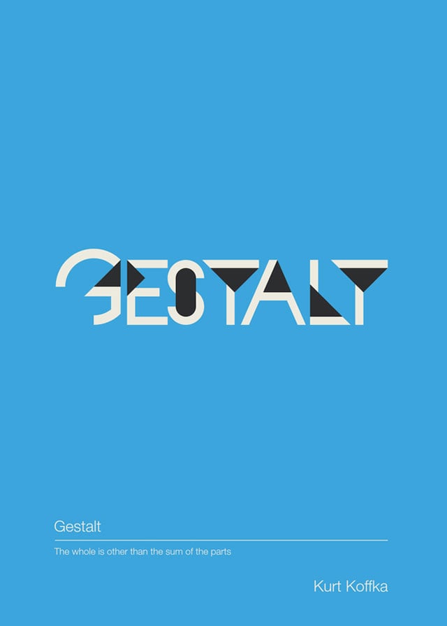
In keeping with this ideal, Ion removes elements of the typeface to generate new lines, new space and new form. He is motivated by the Gestalt principle that the "whole is greater than the sum of the parts".
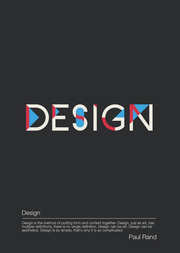
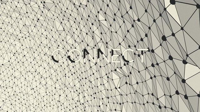
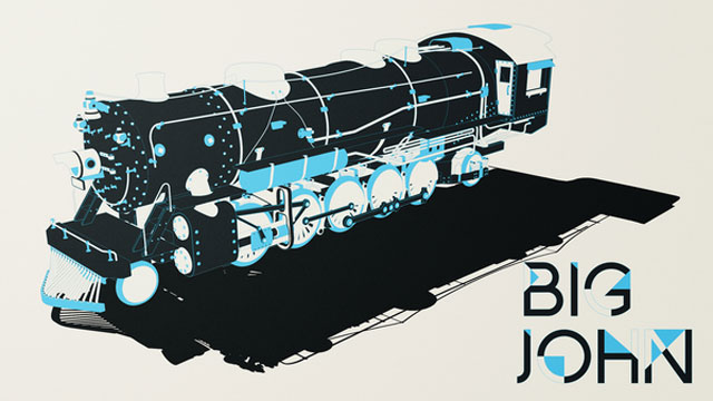
Headjam is inspired by the upper case typeface and decimal slides seen below. They exhibit the pattern Ion describes as they shift through elements of removal and completion under the titles "Form", "Complete", and "Unite".
Here, geometric forms derived from the symbols are projected, implied and combined to create innovative figures and themes that challenge and redefine the mathematics of design.
In conversation with Headjam, Ion said "I am always exploring and breaking the borders of graphic design, so I'm constantly skipping from one creative field to a other, but always respecting the same rules and style, from motion graphics to graphic design, typography, illustration and 3D, and always mixing them up".
Ion is an example of a new and emerging breed of Supercreatives, and the exciting work they can produce. He has an intelligence and skillset that brings together typography and motion graphics, and this can be seen in his designs.
The work seen here builds on the insights established in Gestalt design principles to create and to challenge existing understandings, and that's what a Supercreative does: bring together a diverse skillset and knowledge of history to building something very new.
Check out his impressive portfolio on Behance and his awesome animated vid of the Minim project on Vimeo.
