Do you know about responsive web design?
Headjam thinks that websites should be accessible to anyone regardless of how they access them. You may visit a website on your mobile or handheld device that doesn't work as well as if you access it on your computer. Whilst this is OK in some cases, it makes more sense to view a website tailored for the device you are accessing it with. Previously studio's such as ours would develop a new site for each device which made keeping content up to date a bit complicated.
A new(ish) technique within the webspace that we have been working with for the second half of this year is "responsive web design".
Essentially the idea is that the website changes formation as you change the size of your browser window or if you access it via a mobile device such as and iPhone, iPad or Android device.
To see what we are referring to you can access Headjam's website: www.headjam.com.auon your handheld devices, you'll soon notice that the site works specifically for that device.
Exciting times ahead for developers all over the world and we love been at the forefront of these evolutions.
Feel free to give us a call to find out about how we can help you with a responsive website for 2012: 02 49291154
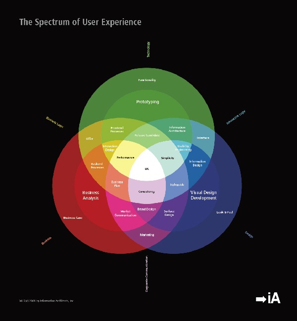
We also stumbled upon this pretty great diagram relating to the whole process of making a website and thought we would share it with you!
Love the Headjam development team x